Cost Optimization Dashboards
The Snowflake Cost Optimization module includes various dashboards.
Certain metrics on these dashboards may not appear for 1 to 3 days, depending on data availability in Snowflake. Weekly derived metrics require at least one week of data collection before they can be calculated.
This section covers the following key areas:
The Cost Optimization dashboards are available starting with version 7.3.1.10.
Organizations
Displays a table of all monitored Snowflake organizations. Select an organization name to open the Organization Overview dashboard. Select a value in the Accounts column to view the list of available accounts for that organization. Selecting an account opens the Account Overview page for the selected account.
The charts at the top display the following metrics:
- Total Spend: A line chart that shows the combined total spend across all organizations.
- Highest Usage: A line chart that shows the combined total spend across all organizations.
- Growth Rate: A bar chart that shows the top five organizations with the highest weekly growth rate.

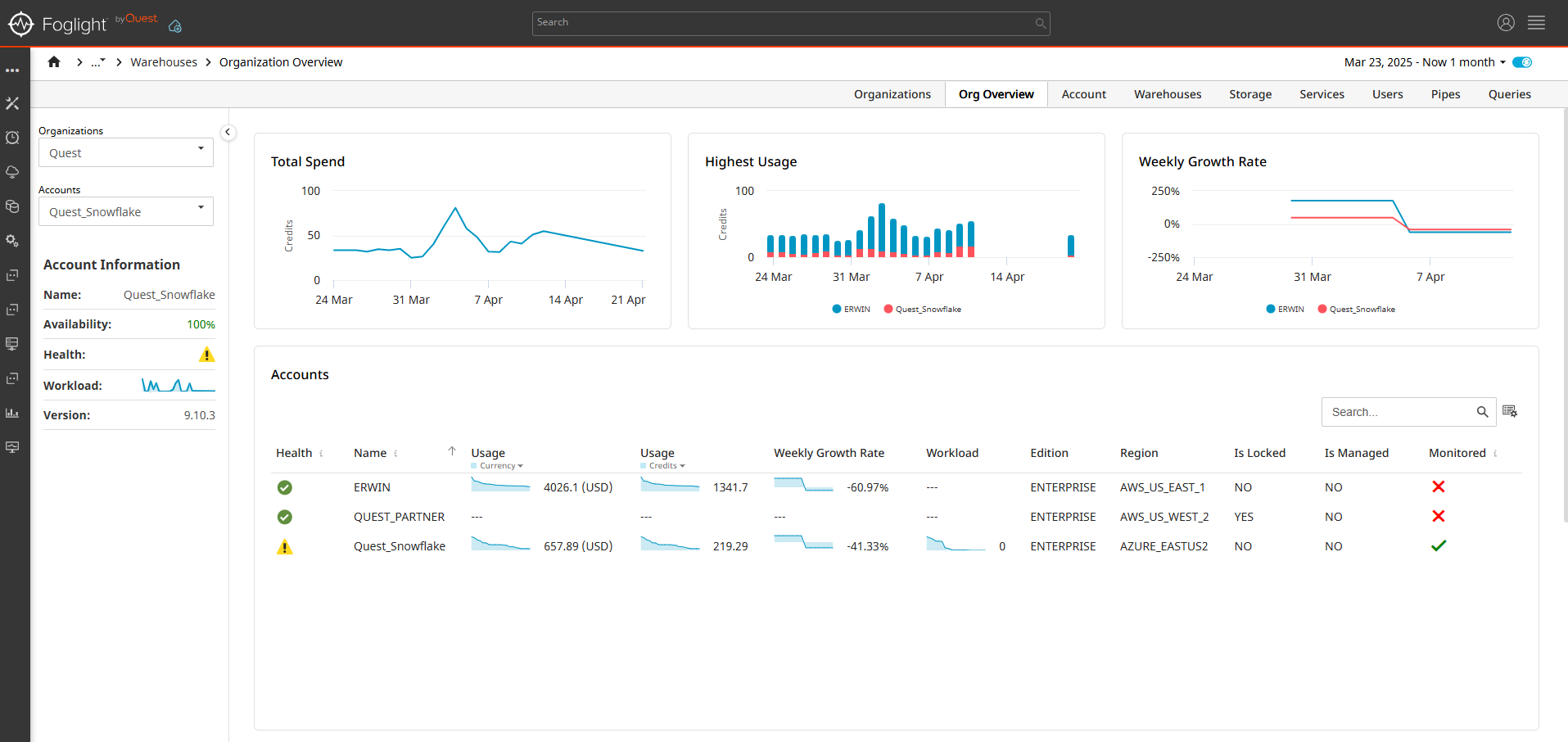
Organization Overview
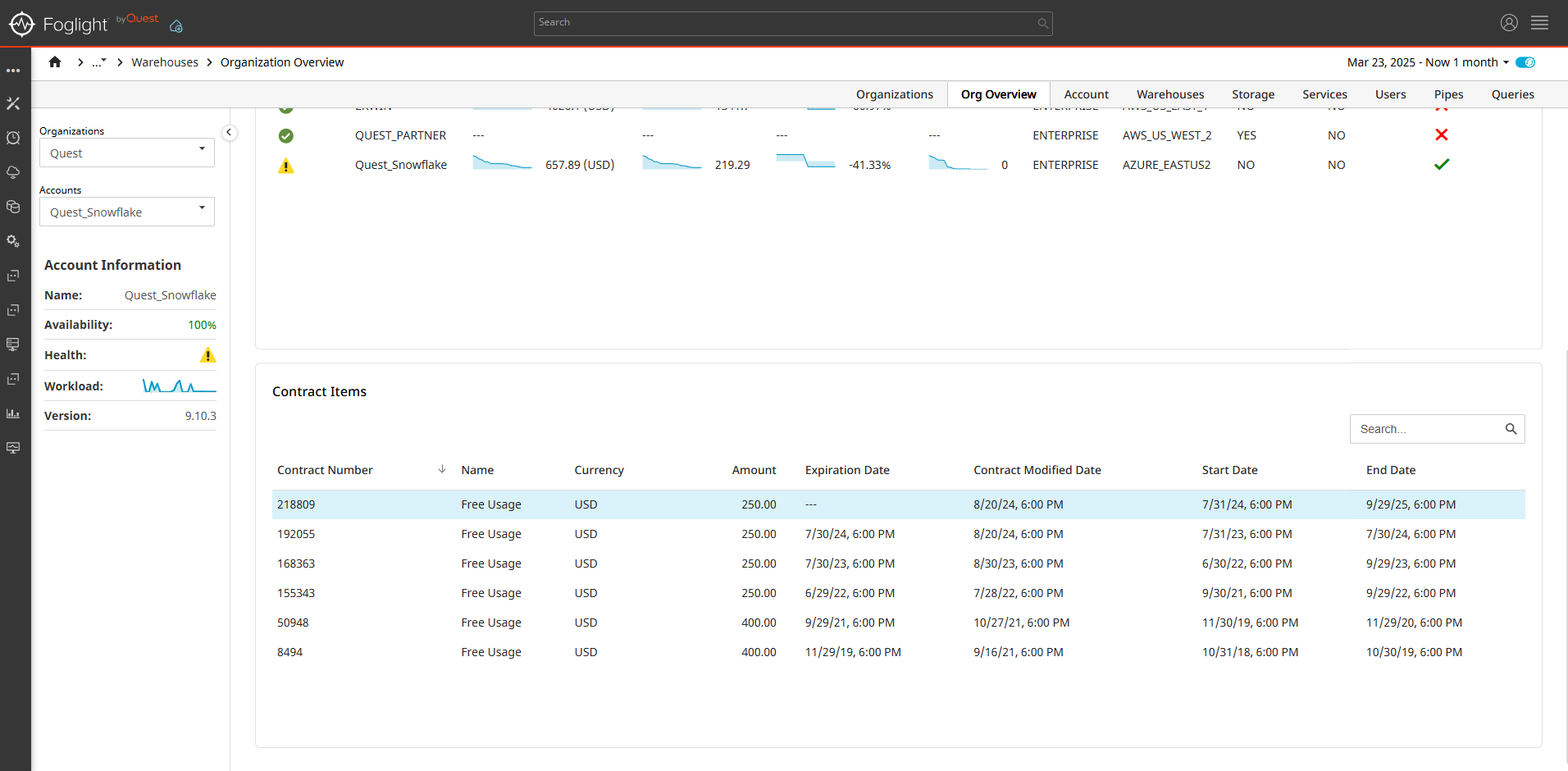
The Organization Overview dashboard displays two tables: one listing all accounts for the organization and another showing the organization’s contract items. Select an account to open the Account Overview dashboard.
The charts at the top display the following metrics:
- Total Spend: The total spending of the organization.
- Highest Usage: The top five accounts with the highest credit usage.
- Growth Rate: The top five accounts with the highest weekly growth rate.
Account Overview
This dashboard displays the following components:
Total Spend chart: The total spending for the account.
Highest Usage chart: Displays the top five Snowflake services by usage.
Growth Rate: The weekly account growth rate.
Hourly Warehouse Credit Usage Heatmap: Displays a heatmap of hourly warehouse credit usage for the last seven days. Selecting a cell in the heatmap opens a drawer showing credit usage by warehouse for the selected hour. Selecting a warehouse redirects the user to the Queries dashboard, filtered by the selected hour and warehouse to show only the queries that ran during that time.
Usage By Balance Source Chart: Bar chart displaying usage by balance source for the account.
Top Ten Queries: Displays the top ten queries by total elapsed time. Selecting a Query will display a Drawer with the Query details and formatted SQL Text.
Top 5 Tables:
- Top five Warehouses by credit usage.
- Top five Users by approximate credits used.
- Top five pipes by credits used.
- Top five tables with most storage used.


Warehouses
The Warehouses Overview dashboard displays a table listing all warehouses, along with the top five warehouses based on the following metrics:
- Highest utilization
- Lowest utilization
- Most memory spillage
- Highest average number of queued queries
The charts at the top display the following metrics:
- Total Spend: The combined total spending of all warehouses.
- Highest Usage: Top five warehouses with the highest credit usage.
- Growth Rate: Top five warehouses with the highest weekly growth rate.

Storage
The Storage dashboard displays a table listing all tables in the account.
The charts at the top display the following metrics:
- Total Spend: The total cost of storage usage.
- Highest Usage: Top five tables with the highest storage usage.
- Growth Rate: Top five storages with the highest weekly growth rate.

Services
The Services dashboard displays a table listing all services excluding storage and warehouse compute.
The charts at the top display the following metrics:
- Total Spend: The combined total spending of all services except storage and warehouse compute.
- Highest Usage: Top five services with the highest credit usage.
- Growth Rate: Top five individual services with highest weekly growth rate of.

Users
The Users dashboard displays a table with a list of all the users in the account.
The charts at the top display the following metrics:
- Top Credit Usage: The top five users with the highest approximate credit usage.
- Top Execution Time: Top five users with most execution time.
- Growth Rate: Top five weekly credit usage growth rate.

Pipes
The Pipes dashboard displays a table with a list of all the pipes in the account.
The charts at the top display the following metrics:
- Total Spend: The combined total spending of all pipes.
- Highest Usage: Top five pipes with the highest credit usage.
- Growth Rate: Top five individual pipes with highest weekly growth rate.

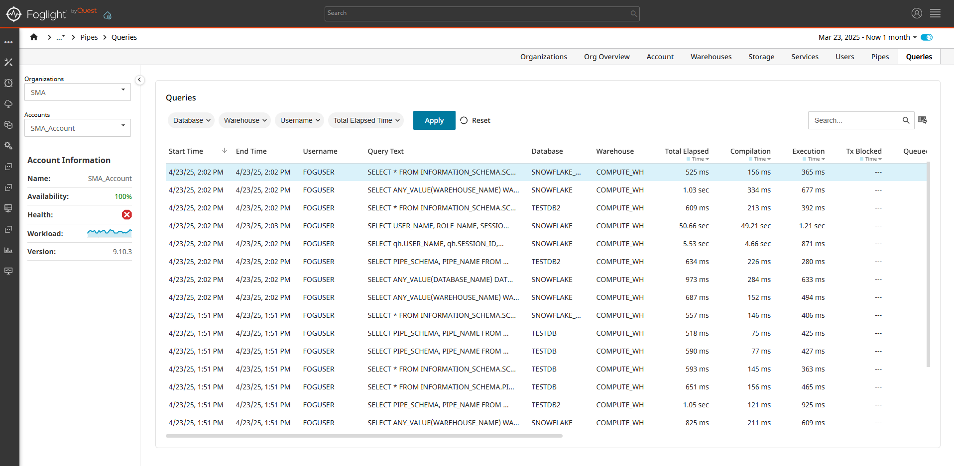
Queries
The Queries dashboard displays a list of the collected queries for the Account. The data can be filtered by database name, warehouse name, username and a range of the total elapsed time.
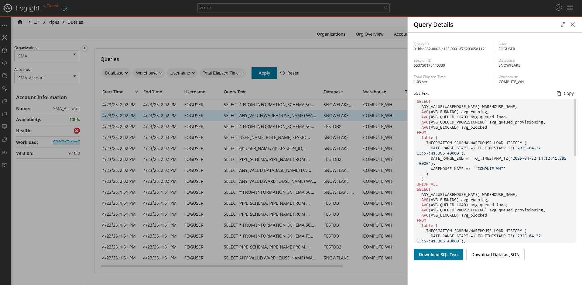
Query Details Drawer
Selecting a query opens a Drawer with the selected query details and formatted SQL text. You can also download the SQL text or download all the collected raw data in JSON format.